Hi guys!
After understanding the Sketch basics, getting our layers organized and loving (I hope) nested symbols, it’s time for some grids and layout practices.
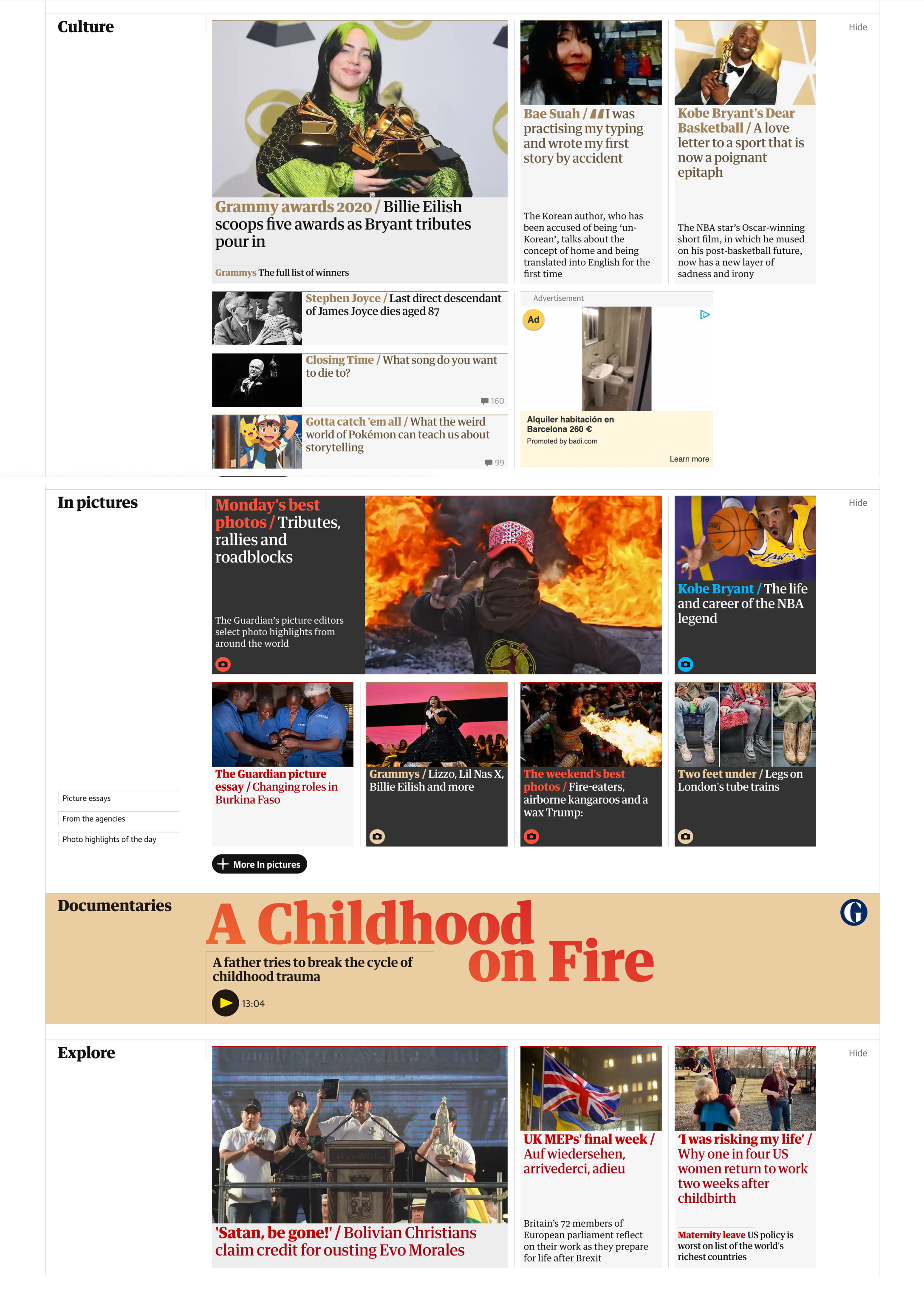
Today’s assignment is going to be understanding how things are laid out on the Guardian website. Pay close attention to alignment and spacing. The first thing would be to create the layout structure with guides, and the second one, using the layout grid.

In this link, you will be able to find the Sketch file, and don’t forget, time-box yourself for 30 minutes.
If you want to learn more about grids and layout, read this article about Building Better UI Designs With Layout Grids.